Yep. Charts are a good thing. Cold hard data is appreciated around here.
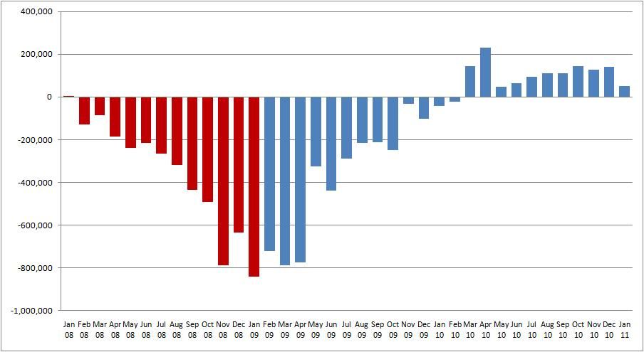
Here's a chart that shows the monthly job losses since the start of the "Great Recession" with an interesting twist: red columns point to monthly job totals under the Bush administration, while blue columns reflect job totals under the Obama administration.
"Art is making something out of nothing and selling it." ---Frank Zappa