Opinions Needed
|
Joined: Feb 2002
Posts: 1,625
connoisseur
|
OP

connoisseur
Joined: Feb 2002
Posts: 1,625 |
As you may have noticed, we're working on expanding our product pages to answer questions that customers have asked. However, we're old-school about long, informative, Alan-Lofft-ized copy. To that end, we're having trouble finalizing a look for the landing pages that set off categories.
Sooooo, opinions needed, please.
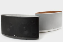
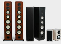
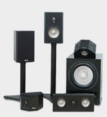
Here's the 'old' look.
Here's the new look.
Here's a third look that is actually old-old look.
I know it isn't an all-things-equal test, and two of the pages are several details away from being ready to take live, but if you can look beyond that to the general look and feel, I would love your feedback, 'cause things are getting passionate around the water cooler!
|
|
|
Re: Opinions Needed
|
Joined: Apr 2003
Posts: 5,236
axiomite
|
|
axiomite
Joined: Apr 2003
Posts: 5,236 |
That's kind of tough.
First off, the "old-old look" is kinda bad.
As far as the "new" vs "old". It's a bit of a toss up.
On one hand I like the "new" look as it's less wordy and you get nice/bigger pictures.
BUT...
You have to look around to find the other systems. They're a bit hidden. The "old" look, I agree, has too much text on the page, BUT it's easier to navigate and find exactly what you need.
Hmmm...
Perhaps you could have a page with the text explaining why you'd want a bookshelf system or a tower based system and links to each catagory up front...then when you clicked either "bookshelf" or "tower" it would bring you to the "new" look, with three big pictures...the M2 system, the M3 system and the M22 system, or likewise, the M50 system, the M60 system, and the M80 system. Then clicking any of those individual systems would give you the sub-catagory options of different subs, centers, surrounds etc...
I know it'd be more individual pages, but it's a way to have the good from both your "old" and "new" looks.
I hope I made even a little bit of sense.
|
|
|
Re: Opinions Needed
|
Joined: Aug 2004
Posts: 6,379 Likes: 7
axiomite
|
|
axiomite
Joined: Aug 2004
Posts: 6,379 Likes: 7 |
Amie, I'm a bit confused. The first link ("old look") is a page that shows your entire Epic lineup, with small pictures and compare/contrast selection information (very important IMO).
The second link has details about a single Epic system, and I assumed that is what you would see if you clicked on one of the systems shown on the first page.
Maybe I'm missing something, but having the first link be your "Home Theater Systems" page and your second link as what you get if you pick one of the systems seems really good to me.
I probably don't understand the question. That happens a lot...
EDIT -- Oh yeah... the prices on the third link were EXCELLENT but when I clicked on "Buy" nothing happened 
Last edited by bridgman; 04/15/05 01:39 AM.
M60ti, VP180, QS8, M2ti, EP500, PC-Plus 20-39
M5HP, M40ti, Sierra-1
LFR1100 active, ADA1500-4 and -8
|
|
|
Re: Opinions Needed
|
Joined: Sep 2003
Posts: 427
devotee
|
|
devotee
Joined: Sep 2003
Posts: 427 |
I like the prices on the old old look.
|
|
|
Re: Opinions Needed
|
Joined: Apr 2003
Posts: 5,236
axiomite
|
|
axiomite
Joined: Apr 2003
Posts: 5,236 |
That was my point. If you look closely from the second or "new" link, you'll notice small buttons at the bottom of those large pics that direct you to the Epic Grand Master, Epic 50, Epic 60 and Epic 80 pages.
But as I pointed out, and as you proved me correct...they're a bit hidden.
|
|
|
Re: Opinions Needed
|
Joined: Mar 2005
Posts: 7,463 Likes: 1
axiomite
|
|
axiomite
Joined: Mar 2005
Posts: 7,463 Likes: 1 |
I think when people first come on a website they like to see pictures--get a nice overview of the selection. Then, a simple click on the picture takes you to the wordy part. Once you know what you're looking for, words are good. At least for me, once I've narrowed my search down, I like to read as much info as I can.
***********
"Nothin' up my sleeve. . ." --Bullwinkle J. Moose
|
|
|
Re: Opinions Needed
|
Joined: Aug 2004
Posts: 6,379 Likes: 7
axiomite
|
|
axiomite
Joined: Aug 2004
Posts: 6,379 Likes: 7 |
I'm on dial-up. When I come to a web site I like to see words. The words help me to decide whether to go make coffee and wait for the pictures or go to some other site
M60ti, VP180, QS8, M2ti, EP500, PC-Plus 20-39
M5HP, M40ti, Sierra-1
LFR1100 active, ADA1500-4 and -8
|
|
|
Re: Opinions Needed
|
Joined: May 2003
Posts: 18,044
shareholder in the making
|
|
shareholder in the making
Joined: May 2003
Posts: 18,044 |
I like the old look, myself. It's clean, but I can see how the old old and new would be useful, but how would you get to them? It looks more like the old would lead to the new or the old old (although I would find that highly irritating-I hate having to dig for web pages.) In other words... dunno!
I am the Doctor, and THIS... is my SPOON!
|
|
|
Re: Opinions Needed
|
Joined: Jan 2004
Posts: 3,016
connoisseur
|
|
connoisseur
Joined: Jan 2004
Posts: 3,016 |
i agree with spiff.. i like the look of the second one listed, but it is hard to find the bigger systems.. i would think you might wanna pull out the big boys first for a visual stimulation, and then make them search for the smaller ones.
so, basically, design looks good, but needs to show BIG systems first, and made easier to navigate.
bigjohn
EXCUSE ME, ARE YOU THE SINGING BUSH??
|
|
|
Re: Opinions Needed
|
Joined: Mar 2005
Posts: 7,463 Likes: 1
axiomite
|
|
axiomite
Joined: Mar 2005
Posts: 7,463 Likes: 1 |
Sorry, bridgman. Dial-up is a wait-a-thon. In that regard, text is a better option. I remember when I was in college we had ethernet connections. When I came home to visit my parents with their dial-up I wanted to pull my hair out!
***********
"Nothin' up my sleeve. . ." --Bullwinkle J. Moose
|
|
|
|
Forums16
Topics24,949
Posts442,517
Members15,619
| |
Most Online2,082
Jan 22nd, 2020
|
|
|
1 members (chapin99),
671
guests, and
1
robot. |
|
Key:
Admin,
Global Mod,
Mod
|
|
|
|